Color Stories, 64 Crayons & Really Good Jazz
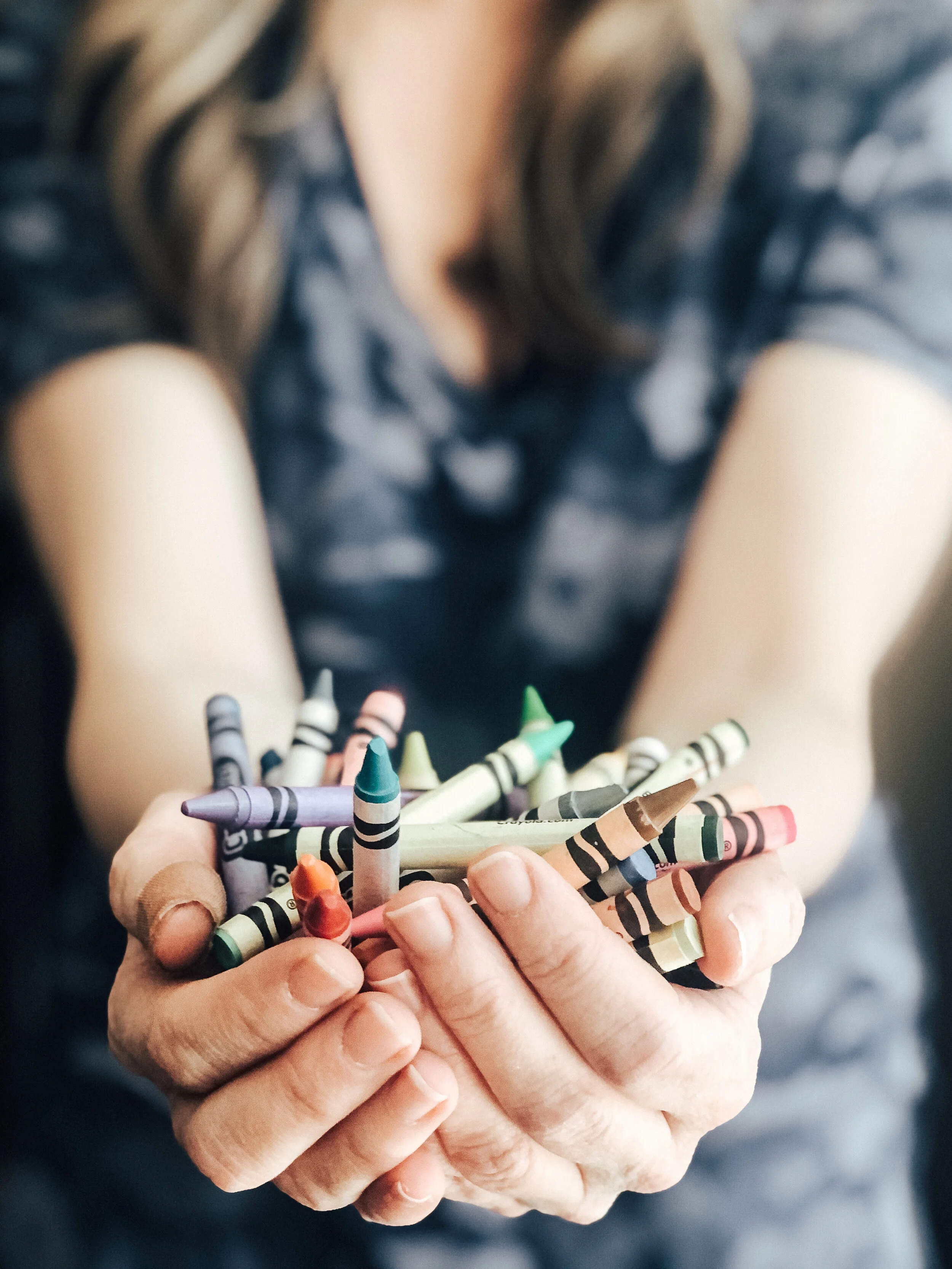
My love affair with color began with my first big box of crayons, the one with 64 “different & brilliant” colors that boldly advertised the built-in sharpener on the back. That box called out to my inner artist, not with red, blue, yellow, but with names like apricot, bittersweet, copper, cornflower, periwinkle, salmon, sea green, maize, midnight blue …. Seriously! There wasn’t a single color I didn’t find something redeeming about (yes, even carnation pink)!
Color has captivated and tormented artists for centuries and it is personally one of my favorite tools as an artist. Maybe it was that first lesson from goldenrod, mulberry and thistle, but I am drawn to the spectrum of colors and even more, the ability of color to call upon and communicate emotions, tell a story and take you on a journey. Color is not to be simply seen, but read, heard and felt. It’s a reminder to take the time to feel and experience life and relationships beyond the surface. Sure, we can give it a quick superficial read and opinion, but as with all relationships, it takes being present to get the most out of what it communicates.
Color stories that fascinate me usually share a common structure, one that always reminds me of the elements of a really good blues song.
A dark color grounds the other colors, giving context and depth to the color palette, like the rhythmic, walking bass notes deep in the mix that give tempo and guide the song.
A light color at the other end of the spectrum, like the grace notes and fills that complement the baseline.
A lead or dominant color, the one that you would notice at a quick glance before all the other colors, like the soulful jazz vocals.
A saturated color that adds a touch of energy and demands attention for a bit of time before releasing your gaze, like the guitar or horn solo.
The neutral color that gives your eye a place to rest and elevates nearby complementary colors, like the background music that carries the song.
Each color has its role, but together they tell a story and communicate a feeling, just like a jazz song comes together to be moody and sad or energetic and heartfelt.
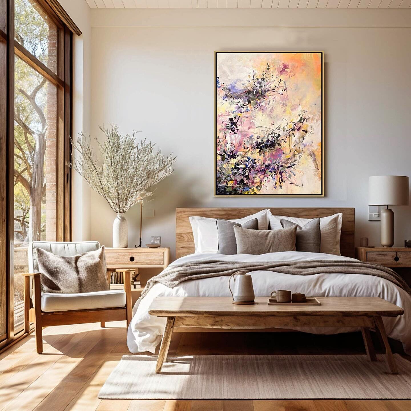
As an artist and designer, I’ve spent years studying colors, how to mix colors, how they change in relationship to other colors, and what combinations are most compelling to me. You don’t need to spend years of research to redesign your bedroom or to find art that compliments your living room. I’ve got a shortcut to use for your designs.
Spend 15 minutes creating your own color story. Whether you know it or not, you have a library of color palettes in your home to use as inspiration or reference.
01. Find a print with 4 or 5 colors that brings you joy, a blouse, dress, scarf, pillow, anything.
02. Describe how the colors make you feel. Write it down or record your description.
03. List and name each color so someone who doesn’t see your inspiration could blindly recreate them. Photograph them for reference.
04. Identify what role each color plays: Dark, Light, Lead, Neutrals, and a Saturated color.
05. Play with the proportions of each in the color story and see how the color palette makes you feel.
06. Use your color story and proportions as reference to redesign a space, find fabrics, artwork, paint colors, decor and have fun.
I’d love to see your color stories! Tag me on Instagram @triciacaracappaart and I’ll share some in my Instagram stories.
“I found I could say things with colors that I couldn’t say in any other way – things that I had no words for.” – Georgia O’Keeffe


